Understanding the Psychology of Color
Color plays a pivotal role in setting expectations and influencing emotions. Bright colors like red and yellow often evoke feelings of excitement and can stimulate appetite, whereas cool colors like blue may suppress it. Chefs use these psychological cues to create a desired atmosphere around their dishes.
Choosing the Right Plate
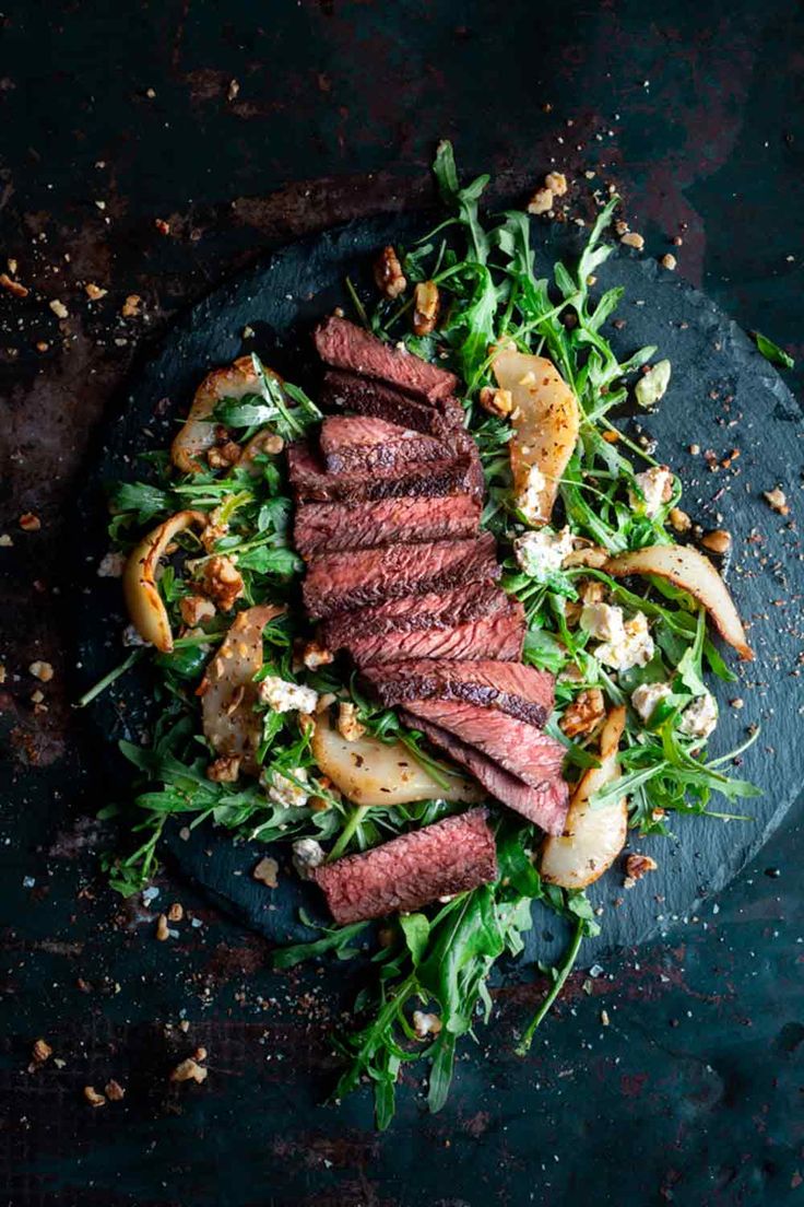
The backdrop of a dish, the plate, significantly impacts how colors and food are perceived. White plates are a popular choice because they provide a neutral background that makes the colors of the food pop. However, darker plates can make vibrant ingredients stand out and add a dramatic effect.
Balancing Colors
Chefs aim to balance colors to achieve harmony on the plate. This doesn’t mean using as many colors as possible, but rather selecting a palette that complements the dish. For instance, a dish with green and red components can be balanced by neutral tones like browns and whites, or a vibrant orange carrot puree can contrast beautifully against a dark piece of meat.
Highlighting Key Ingredients
Colors can also be used to highlight key ingredients. Chefs might use a brightly colored sauce or edible flowers to draw attention to a specific part of the dish, guiding the diner’s eye to where they should focus their attention or start their meal.
Seasonal and Natural Colors
Seasonal colors can reflect the freshness of the ingredients. Spring dishes might incorporate bright greens and yellows, while autumn might bring deep reds and oranges onto the plate. Utilizing natural colors also ensures that the dish looks more appealing and suggests high-quality ingredients.
Artistic Techniques
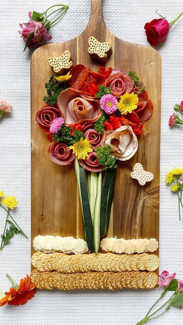
Techniques such as painting with sauces, creating colorful garnishes, and using ingredients with natural pigments are common. Beetroot, for instance, offers a vibrant red hue, while turmeric can bring a burst of yellow. These natural colors can be used to paint or dot around the plate artistically.
Contrast and Complements
Playing with contrasting colors or complementary colors from the color wheel can enhance visual appeal. A dish dressed in contrasting colors like blue and orange can be striking, whereas complementary colors like yellow and purple can heighten each other’s presence on the plate.
Consistency and Theme
Maintaining consistency in color use according to the theme of the menu or restaurant can also be effective. A seafood restaurant might use blues and greens to reflect the oceanic themes, whereas a vegan or health-focused eatery might highlight vibrant, fresh vegetable hues.
Culinary Presentation Tips from Chefs
Use Color Sparingly: Overloading a plate with too much color can be overwhelming. Less is often more in fine dining.
Natural Ingredients: Always opt for natural sources of color to avoid artificial appearances.
Test Color Combinations: Experiment with different combinations on small sample plates to see what works best.
Consider the Dining Environment: The restaurant's lighting and decor can affect how food colors look. Always consider these elements when designing a plate.


